In “Squid Game,” the runaway Netflix hit, the brutality of surviving at all costs was rendered all the more visceral by a backdrop befitting a children’s storybook. We caught up with art director Chae Kyoung-sun, the mind behind the set design, at an underwater filming studio in Goyang, Gyeonggi Province.
“Squid Game” was the most-watched Netflix show for 46 days, drawing the viewership of 142 million households after its debut last September. Theories abound on why it was so immensely popular worldwide on the streaming platform. One certainty is that the spectacular and refreshing – and at times surreal – set designs played a big role. Unlike the backdrops of most movies and TV shows, “Squid Game” did not stress realism. It aimed for a blend of reality and fantasy using a bold and limited palette. The result was a striking example of how production design can seamlessly compliment a storyline and characters. Art director Chae Kyoung-sun, who majored in stage design at Sangmyung University’s Department of Theater and Film, made her debut in 2010 with “Come, Closer,” a film about five couples, directed by Kim Jong-kwan. “Silenced,” from director Hwang Dong-hyuk, followed the year after, and then two more of Hwang’s movies: “Miss Granny” (2014) and “The Fortress” (2017). “Squid Game” was the first original series in Chae’s recurring collaboration with Hwang. Her other film projects include “Hwayi: A Monster Boy” (2013) with director Jang Joon-hwan, “The Royal Tailor” (2014) with director Lee Won-suk and “EXIT” (2019) with director Lee Sang-geun. In each production, Chae was credited for creating exactly the right kind of space necessary to open up the narrative at hand.
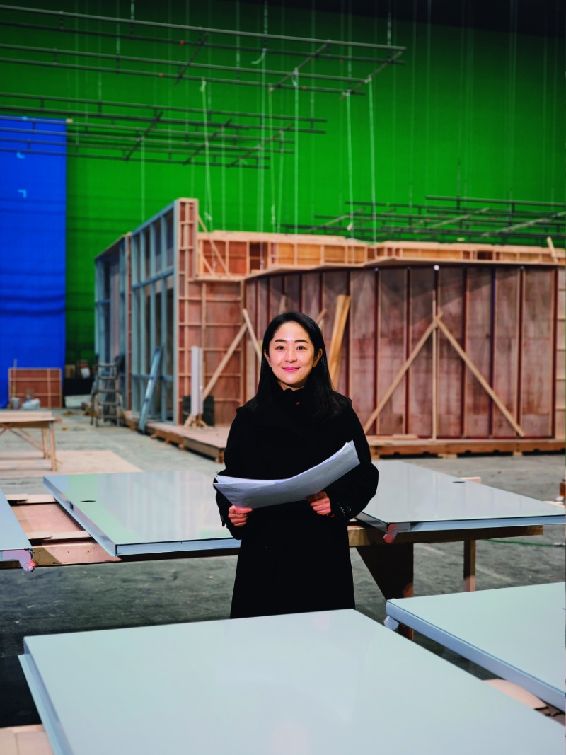
Art director Chae Kyoung-sun poses at a special aquatic set for her next project, the Disney Plus original series “Moving,” in Goyang, Gyeonggi Province. As the art director of “Squid Game,” Chae’s stature soared when the Netflix mega-hit series became an international sensation. She says she feels incredibly lucky for the financial support and creative freedom she has been able to enjoy.
“Squid Game” is a far cry from director Hwang Dong-hyuk’s previous works. What was the challenge?
Since the spaces we were creating weren’t strictly realistic, I did expect the set design to be quite polarizing for audiences. I figured there would be fairly strong negative reactions, as well, so I tried to prepare myself for that – but luckily, many have reacted positively. It’s not often that an art director gets the chance to try something truly new. We had a generous budget, too, so I was able to fully realize the designs I had in my mind. Getting to be a part of this project was a huge stroke of luck, all around.
What were the rules you agreed upon with Hwang?
Broadly, it came down to three things. First, let’s not make the world look too dark. Second, let’s imbue the backdrop for each game with a distinct feel all its own. That was important to heighten the fear and confusion of the characters, who had no idea, entering each space, what the game was going to be. At the same time, we wanted the audience to wonder what kind of game was going to take place next, in what kind of space. And last, let’s be bold with color. Compared to Hollywood movies, Korean movies tend to be somewhat conservative in their use of color. We wanted to cast off those limitations and just be really bold with our colors. Though, actually, I will say that recently, as Korean movies have started branching out into new genres like science fiction, the spectrum of colors we tend to see has definitely started to expand.
What were the criteria for the colors?
Initially we considered using mint and pink as our two main colors – retro shades, really, that represent the 1970s and 1980s. In response to that, our costume designer, Cho Sang-kyung, was like, “Let’s go big and use pink for all the guard uniforms!” And then we turned up the saturation on the gym uniforms for the players themselves, and went with a deep green. In this series, pink stands for oppression and violence, while green symbolizes persecution and losers. So, we had the players move through structures surrounded by pink ceilings and walls, and had the guards return to dormitories that were painted in greens. We used the colors to set the worldview and rules of the story.
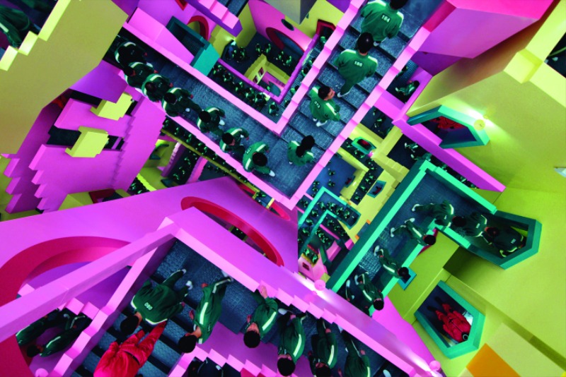
”Squid Game” players move through a maze of stairs. The juxtaposition of brutal survival games against a backdrop of childlike visuals and pastel hues effectively captures the paradoxical nature of capitalist society. This particular set was inspired by the work of Dutch artist M. C. Escher.
© Netflix
What about the first game, “Red Light, Green Light”?
Well, the concept of that game boils down to “real versus fake.” In that space, the blue sky above and the wall behind the Young-hee doll are fake, but if you don’t get through the game, you really die. We took some of our cues there from the paintings of René Magritte and tried to make a space that would be confusing for the players inside the game as well as the viewers watching at home. Meanwhile, the idea to have the higher-ups watching it all unfold was influenced by the 1998 comedy movie “The Truman Show.”
How was the giant doll made?
The doll was produced by the special effects team, Gepetto. It’s 10 meters tall, and so they transported it in two pieces: the top half and the bottom half. Originally, Hwang wanted the art team to make 10 different Young-hee dolls, but we didn’t have the budget for that. Also, in the , the doll was supposed to rise up from underground, but that got changed during filming.
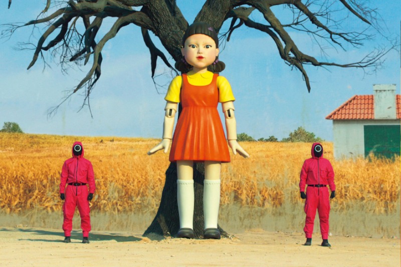
The arena for the first contest, “Red Light, Green Light,” looked to Belgian surrealist painter René Magritte. Reality and fantasy combined to create confusion. The 10-meter-tall Young-hee doll, an audience favorite, was produced by Gepetto, a special effects team.
© Netflix
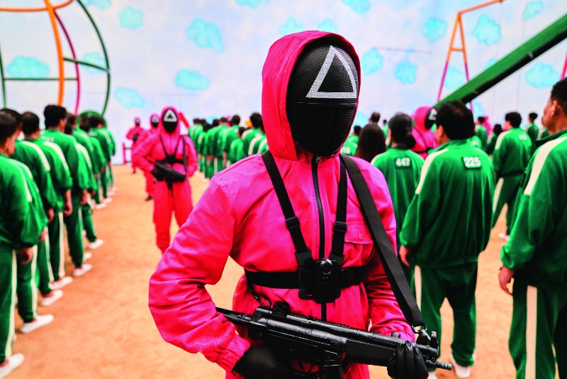
Green and pink, employed throughout the episodes of “Squid Game,” symbolize persecution/losers and oppression/violence, respectively.
© Netflix
Were the marble game alleys very difficult?
Yes, that web of alleyways was one of the hardest sets. This was another space where the fake and the real existed side by side. The director wanted us to make a sunset and a space in which you could smell dinner cooking. He told us about how his mother would call out to him in the evening and how he could smell dinner cooking as he approached his home. Except for grandpa Oh Il-Nam’s house, all the other houses were designed basically as a series of front doors. We wanted many doors, but if you tried to enter, you’d be turned away, like, “This isn’t your home, so you’re not welcome here.” We made the front doors look real with props like door plates and coal briquettes and potted plants, and also created a pattern with them – coal briquettes near the losers and potted plants near the winners.
In this and in previous projects, how do you reach for emotional impact?
My approach is different for every project. On the most basic level, an art director’s job is to take the story and the characters the director wants to present and make it all richer. The art can’t stand out too much; it has to feel natural. That’s why I’m always working to better understand the , trying to get even deeper into it than the directors themselves.
What about “The Fortress,” based on a real historical event?
We wanted it to be the most thoroughly researched and accurate period film about Korean history that had ever been made, so we really gave it everything we had. The snow, the cold and the isolated fortress itself, surrounded on all sides by the enemy – we worked hard to bring it all to life.
“The Royal Tailor” came before that. Did it influence you during “The Fortress”?
The main set for that film was the space where they made the clothes for the royal court, so I spent a lot of time thinking through how to represent that visually, and how to use that space to best render the various characters. It’s a shame that it didn’t do very well at the box office.
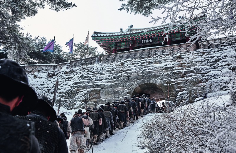
“The Fortress” depicts 47 days in Namhan Mountain Fortress as the king and his officials seek refuge from Qing invaders in 1636. Through extensive historical research, art director Chae Kyoung-sun successfully blended the snow, the cold and hardship of the winter siege.
© CJ ENM
What about “Silenced,” set in a school for the deaf where dark things happen?
That movie had a shoestring budget, so we were limited in what we could try and do. The only new sets we built from scratch were the principal’s office and the courtroom. Fog was actually really important in that film, and so we went with shades of gray for all the main spaces, and even the props and hallways. As the story unfolded, it was important to suppress color rather than enhance it. The one exception was the human rights center where the protagonist, played by actress Jung Yu-mi, had her office; there, we went a little warmer by throwing in some olive tones. That project was about dialing back my own instinct for more, as an art director, and just sticking as close to the bare bones of the story as possible.
The scenery in “EXIT” was distinctly Korean.
At first, I thought of it as a kind of classic, Hollywood-style disaster movie. But as I talked more with the director, Lee Sang-geun, I realized that figuring out a way to express a distinctly “Korean space” was actually crucial. I visited countless rooftops all across the country, researching their various characteristics. There was one scene in particular, where the male and female leads run as fast as they possibly can to take this great leap over a pedestrian overpass. The two buildings that are visible on either side are key. I’m very happy with how that turned out, even though it’s only on screen for a second, really. This was a case where the director really listened to the art department, and the art department, in turn, used a lot of the director’s ideas. It was a very collaborative movie, very fun to work on.
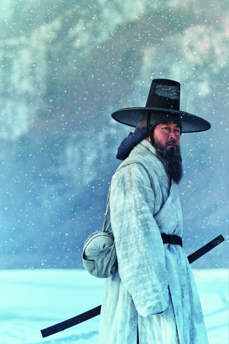
In this scene, Minister of Rites Kim Sang-heon (played by Kim Yun-seok) crosses a frozen river on his way to the stronghold.
© CJ ENM
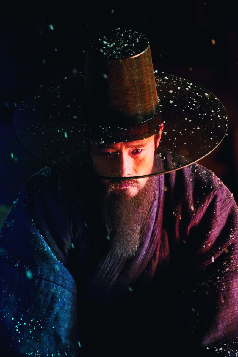
Two principal characters in “The Fortress” are polar opposites in their ideologies, a deep contrast reflected in their costumes. Minister of Personnel Choi Myung-gil (played by Lee Byung-hun) pleads for surrender to protect the kingdom and its people, while Kim Sang-heon argues for taking a final stand against the invaders.
© CJ ENM
What about your current project, “Moving”?
It’s a Disney Plus original series by director Park In-jae. I’m afraid I can’t share any details about it before the official release, but I can say that it’s the first live-action adaptation of the popular eponymous webtoon series by Kang Full. It’s been a new and exciting challenge for me because the story spans over 30 years, from the 1980s to 2018.
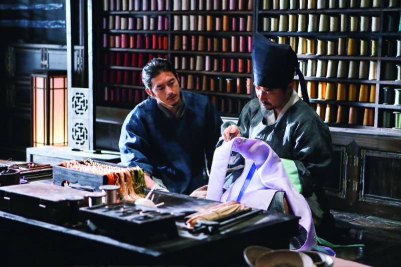
Born fashionista Lee Gong-jin (played by Go Soo) watches the needlework of Cho Dol-seok (played by Han Seok-kyu), tailor to the royal court for some 30 years. Director Lee Won-suk’s “The Royal Tailor” (2014) is set in the Joseon Dynasty, showcasing gorgeous palace costumes and interiors.
© WOWPLANET KOREA