Over the past six centuries since its creation, Hangeul has changed to take many different forms, reflecting the technology, aesthetics and spirit of each respective era.
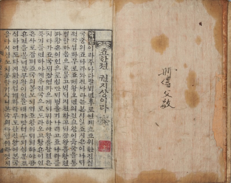
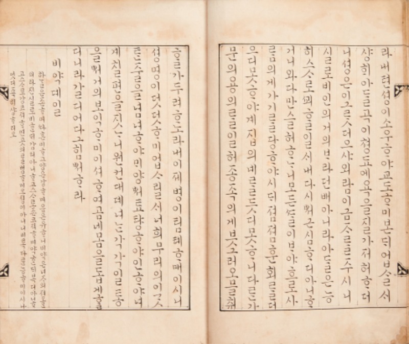
“Story of the Chu and Han States” (Chohanjeon). Latter half of the Joseon Dynasty. Author unknown. Wan Block Edition.A commercial edition of a historical novel depicting the conflict between Xiang Yu of Chu and Liu Bang of Han in ancient China. Woodblock print books published by private concerns during the latter half of the Joseon Dynasty were called banggakbon. These books were identified by the place in which their printing blocks were carved: Gyeongpanbon (capital block edition) from Seoul; Anseongbon (Anseong block edition) from Anseong, Gyeonggi Province; and Wanpanbon (Wan block edition) from Jeonju, Jeolla Province. Wan block editions feature large, neatly formed letters, as seen in this novel.
© National Hangeul Museum
Most alphabets around the world resemble either the shapes of objects or a slice of topography. In contrast, the Korean alphabet is phonetic and mimics the shape of the mouth as the language is spoken. Its 24 letters are composed of horizontal, vertical and curved lines, as well as a square and circle. They form consonants and vowels that combine to produce “all sounds in nature under heaven,” as stated in “Hunminjeongeum” (Correct Sounds to Instruct the People), the document that first introduced Hangeul in 1446. The consonants are extended and combined by adding strokes to account for tense and lax sounds produced by the vocal cords.
Hangeul didn’t immediately become the official writing system for the Korean language upon its creation; officials and scholars continued to use Chinese characters. But women in the royal court and people in Buddhist circles disseminated the native until it gradually spread beyond the elite, as King Sejong had intended. By the time novels written in Hangeul became popular during the late Joseon period, many people, regardless of age or social status, were already reading and writing in the Korean . Throughout this process, typefaces that showcased the beauty of the letters were created.
Early Styles
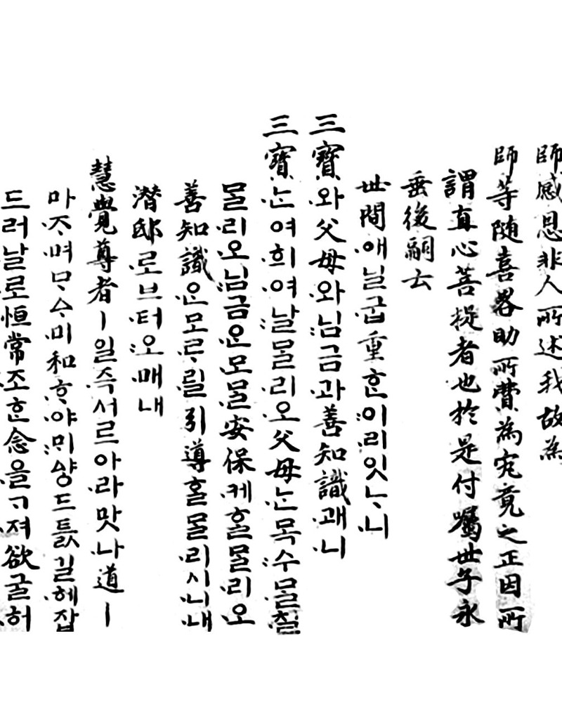
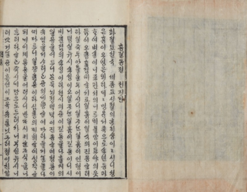
“Hunminjeongeum” was printed in angular, sans-serif lines of even thickness. The square-shaped syllable blocks combining consonants and vowels looked imposing.
Bibliologists say that King Sejong liked the full, rich appearance of Chinese writing. But the early typeface for Hangeul featured the simple straight lines and geometric shapes that the king used to invent Hangeul. This style was only used in a few ensuing books, however; as ink brushes were the primary writing tools at the time, it was too difficult to consistently produce letters with the same thickness on wooden printing blocks. In the following centuries, other styles appeared, reflecting the aesthetics and technology of their era.
AG Hunminjeongeum, a typeface released in 2018 by AG Typography Institute. It was designed to fit modern written Korean in horizontal lines, based on the typeface used in “Episodes from the Life of Sakyamuni Buddha (Seokbo sangjeol), published in 1447.© AG Typography Institute
Influence of Chinese s
In the beginning, Hangeul was written as if the letters were Chinese characters. Like the Chinese kaishu (regular) , in which vertical and horizontal strokes are written neat and straight and the whole character fills a square, Hangeul adhered to squared proportions. Brush strokes extended in all four directions from the center, and the number of strokes dictated the density.
This style of Hangeul can be seen in a document written by King Sejo (r. 1455-1468), the second son of King Sejong, in the 10th year of his reign to encourage the people to contribute to the reconstruction of Sangwon Temple in Pyeongchang. The writing in uigwe, the Joseon Dynasty’s state records of court ceremonies and important national events, is neat and regular. Presumably, those state records would have been written accurately by the most famous calligraphers and in the most representative of the time.
“An Illustrated Guide to the Five Moral Imperatives” (Oryun haengsildo), published during the reign of King Jeongjo (r. 1776-1800), is a collection of stories about people who practice the virtues that constitute the basis of human relationships. The letters in this book are vertically and horizontally symmetrical, and the looks gentle but full of integrity.
Sometimes, Hangeul was written in the style of the Chinese xingshu (semi-cursive) , which has the characteristics of regular with an added sense of speed in the connection of dots and strokes. Of course, Hangeul letters have fewer strokes than Chinese characters, so it’s hard to create as much contrast between the strokes, but the vowels and consonants can still seem precise and firm within a square and even elegant and relaxed when the space inside the square is well adjusted. The writing styles of famed scholar and calligrapher Yang Sa-eon (1517-1584) and King Hyojong (r. 1649-1659) are free and overflowing with energy, reminiscent of the xingshu .
“Recommendation of Donations to the Reconstruction of Sangwon Temple in Pyeongchang” (Pyeonghang Sangwonsa jungchang gwonseonmun). Handwritten document. 1464.This document was sent along with goods endowed by King Sejo in 1464, the 10th year of hisreign. A similar document was written by Shinmi, the royal preceptor at the time of the temple’sreconstruction, and his fellow monks. Both Hangeul and Chinese characters were used, and the Hangeul version is among the oldest extant handwritten Hangeul documents. The letters are squared and symmetrically balanced, the forceful strokes emanating an air of dignity.
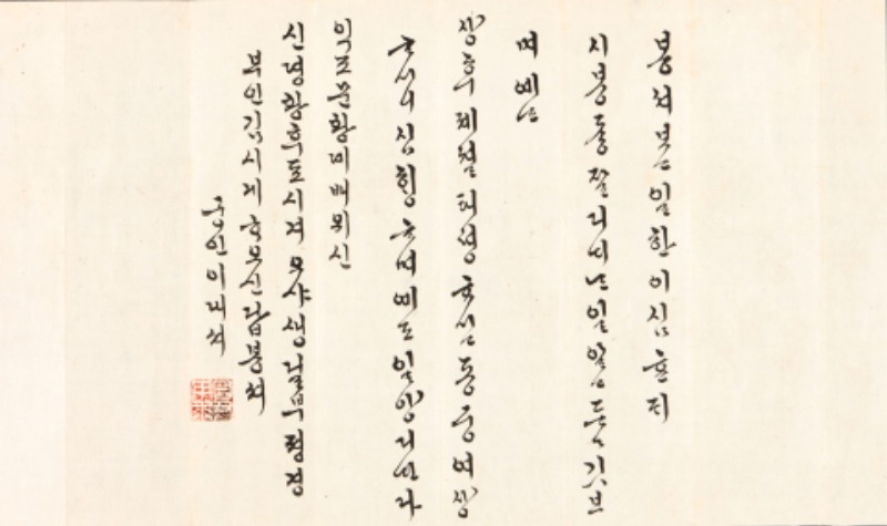
A letter written by King Hyojong (r. 1649-1659). It is included in “Royal Letters to Princess Sungmyeong” (Sungmyeong sinhan cheop), a collection of 66 letters received by Princess Sungmyeong, the third daughter of King Hyojong. The letters were written by the king and hisconsorts, with one letter written by the princess. The king’s letter is written in a Hangeul with the features of Chinese semi-cursive ; the free-flowing letters exude a powerful, magnanimous feeling.
© Cheongju National Museum
Court
Unique formative qualities began to appear when Hangeul usage reached critical mass. The style used by women in the royal court was called gungche, literally “court .” This ink-brush style of calligraphy was also referred to as seoganche, or “letter ,” because it was often used to write letters.
The court obtained its graceful style in the late Joseon period, which remains in use today. Its block letter form is trim and neat while its cursive form is free flowing and sometimes even ornate. Vowels form the physical pillar of the letters while the final consonants determine the width. When assembled, they constitute either wide or narrow rows of letters that function similarly to the baseline and x-height (or the height of lowercase letters) of Latin fonts.
“Four Books for Women” (Yeo saseo). Handwritten. Presumably 19th century.A hand-copied version of a Hangeul annotation on Nu sishu, a Chinese book with the same title, written by civil official Yi Deok-su under the orders of King Yeongjo (1724-1776). As clearly shown in this writing, the axis of court letters is on the right, meaning that the letters change in form according to the vowels though the consonants may be the same. The balanced connection of vowels and consonants gives the letters a concise look.
© National Hangeul Museum
Court ladies serving under women of the royal household wrote personal letters for members of the royal family as well as official documents. This document was written in cursive court by Lady Yi, a scribe who served Queen Sinjeong (1808-1890), mother of King Heonjong. The dynamic handwriting, with its strokes of varied thickness and proportions, creates a piece of fine calligraphy.
© National Museum of Korea
Typefaces for Commercial Publications
When novels written in Hangeul rather than in literary Chinese grew popular in the 18th and 19th century during the late Joseon period, private publishers began to print and sell books in large quantities. The typefaces on the woodblocks used to print the novels were developed in the private sector, and these books were called banggakbon, meaning “commercial woodblock print editions.” The characteristics of these typefaces emerged as printers hastily carved letters on the woodblocks. The process didn’t prioritize the clean uniformity that was found in publications regulated by the royal court. Thus emerged the simple flair of typefaces used by the ordinary people.
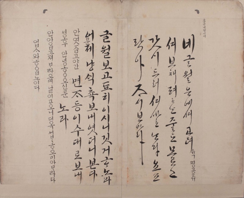
“Story of Hong Gil-dong” (Hong Gil-dong jeon). Latter half of the Joseon Dynasty. Capital Block Edition.This is a commercially published copy of the first novel in Hangeul, written by Heo Gyun (1569-1618) in the mid-Joseon period. The hero, Hong Gil-dong, punishes corrupt officials and builds an ideal state. Compared to other editions, the capital block editions (Gyeongpanbon) have smaller letters, which are finely carved in cursive style.
© National Hangeul Museum
Dyoung (or Joung), a digital font released by type designer Ha Hyeong-won in 2017. The font is a modern reinterpretation of the typeface from “Story of Dyoung” (Dyoung jeon), a novel published in the early 20th century. In semi-cursive style, it was developed for a vertical format.
© Ha Hyeong-won
Modern Typefaces
When the influx of Western culture began around 1945, the vertical format of writing began shifting to a horizontal layout for left-to-right reading. However, experimentation with typefaces generally remained stagnant. There was little interest in diversifying typefaces during the decades that saw the decline and fall of Joseon in the late 19th century; the Japanese occupation (1910-1945), during which the colonial government tried to banish the Korean language; the Korean War (1950-1953); and the postwar reconstruction of society and economic development.
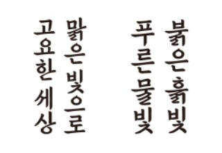
And yet, the shift from vertical to horizontal gave rise to new Hangeul letter forms, most notably typefaces that broke out of the square block shape. When such letters are written in a horizontal arrangement, they can develop a rhythm that brings to mind children bouncing up and down to a merry tune. After the 1990s, when a measure of economic stability was achieved and Korean society began pursuing cultural diversity, notable changes in Hangeul typefaces began to appear.
In terms of visual culture, however, Korea was still striving to catch up with Western nations. Now, a decade or so later, new generations of designers are creating varied typefaces through free experimentation, including creative reinterpretations of past styles. In today’s digital age, thanks to sophisticated computer software programming, Hangeul typefaces are expected to evolve more rapidly and extensively.
“Hunminjeongeum” was printed in angular, sans-serif lines of even thickness. The square-shaped syllable blocks combining consonants and vowels looked imposing.
Choijeongho Std.The last original typographic drawing by Choi Jeong-ho (1916-1988), a pioneer in modern Hangeul typeface development and design, presents a serif typeface created for print, based ontraditional brush-written court . Unlike the common style of the time, the letters are condensed with large serifs and sharp tips, creating a strong visual impact. This Hangeul typeface is considered the most ideal in form and is the standard for body texts.
© AG Typography Institute
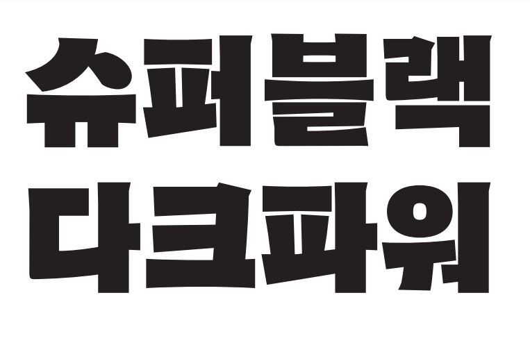
310 Ahn Sam-yeolThis typeface, released in 2011 by graphic designer Ahn Sam-yeol, shows a strong contrast between vertical and horizontal strokes. It was developed for use in titles; the bigger the letters, the more the distinguishing features are magnified. Recognized for exploring new aesthetic possibilities in Hangeul typeface design, it won the Type Design Prize at the 2013 Tokyo TDC Annual Awards.
© Ahn Sam-yeol
AG Mano 2014Ahnsangsoo font, released in 1985 by graphic designer Ahn Sang-soo, is the prime example of a font breaking away from squared letters. Later, Ahn further experimented with three-set modular typefaces that distinctly expressed the simplicity of Hangeul letters. One of these was Mano, introduced in 1993, in which the letters consistof stroke modules and change in size according to the number of strokes. AG Mano 2014 is an upgraded version of Mano.
© AG Typography Institute
BaramThis typeface, released in 2014 by Hangeul designer Lee Yong-je, was produced through crowd funding. Designed for display purposes, it is a reinterpretation of the type produced in the early 1900s by Park Gyeong-seo, who worked for the royal type workshop of the Joseon Dynasty. The overall structure of letters is based on the Myeongjo (Ming Typeface) and the dots and strokes on court . Developed for titles written in vertical form, this typeface has been widely used, including the title for singer IU’s album, “Flower Bookmark” (Kkot-kalpi).
© Lee Yong-je
Dunkel SansA striking, boldly experimental typeface used for titles. Released in 2018 by type designer Ham Min-joo, who is based in Germany, it was inspired by the lettering on the posters of foreign movies that screened in Korea in the 1950s.
© Ham Min-joo
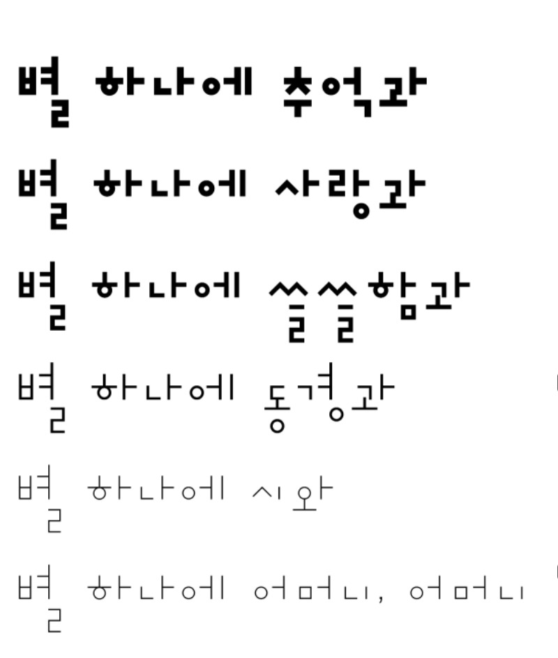
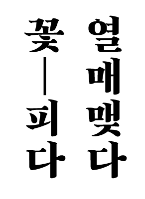
SimsimThis typeface was created in 2013 by Lee Yong-je in an experiment to break away from typical square letters. The letters expand in area depending on the number of strokes, and when written in horizontal lines, the rhythmic feel increases.
© Lee Yong-je